Photo by Anirugth on Unsplash
LONG STORY SHORT
TIME
2 months
TEAM
METHODs
Personas
User Journey
Wireframe
Prototype
Testing
TOOLs
Adobe XD
FigJAM
SOLUTION
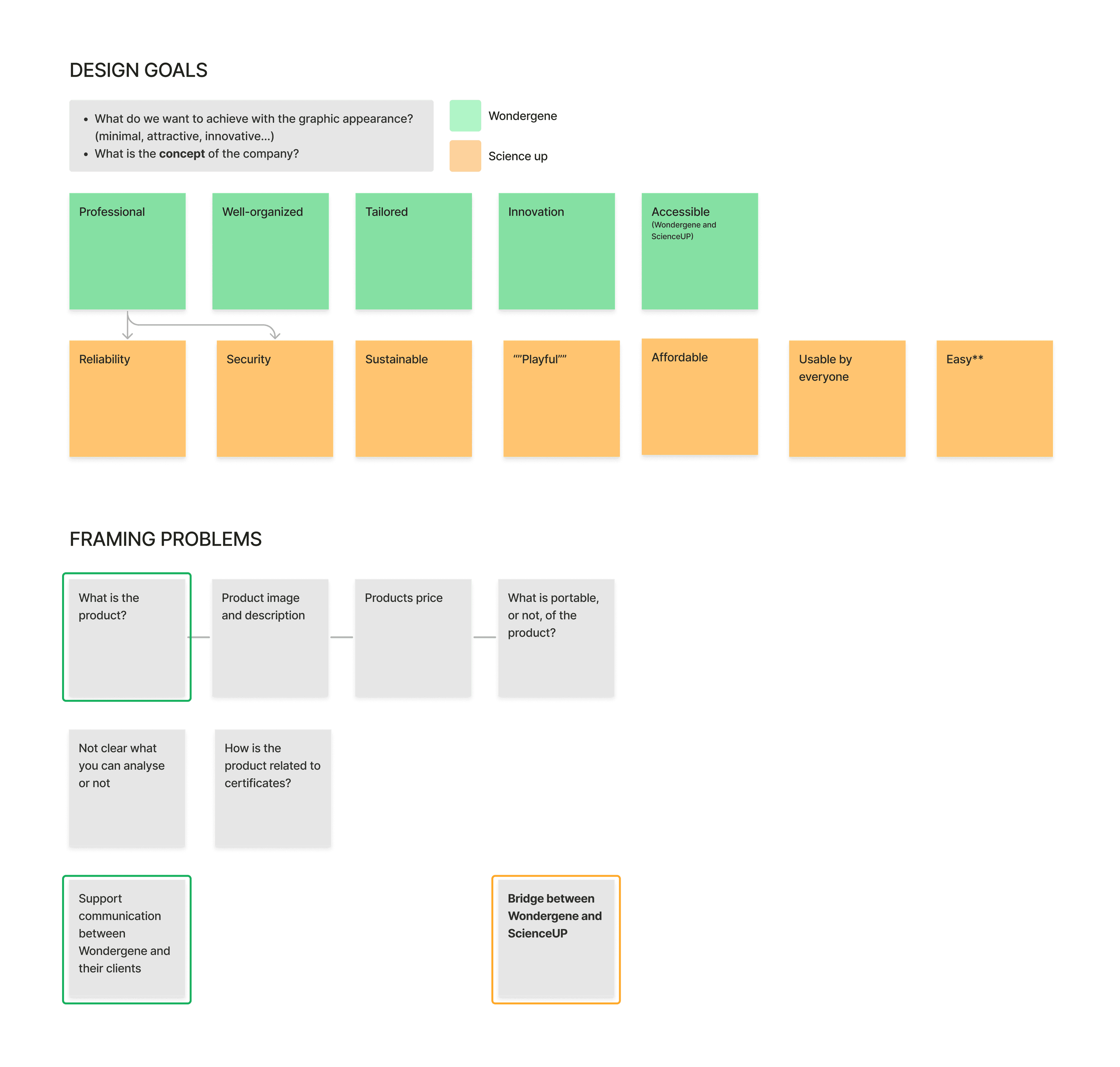
Our main objective was to focus on what the users need the most:
clarity regarding the services the company offers
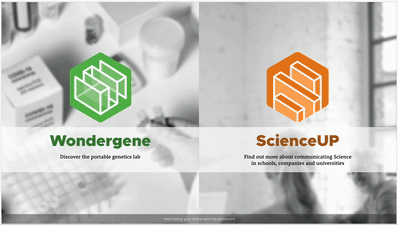
a dedicated section for the product they sell: the genetic analysis kit
a smooth integration between the different sides of the company (Wondergene and ScienceUP)
The steps we followed to get to the solution:
Empathise
Define
Ideate
Prototype
Test

new look and feel, respecting the brand identity
EMPATHISE
We started by trying to understand a bit more about the company itself, about their needs and requirements for the website and about their customers.
We analysed their current website and identified issues and goals of our design.
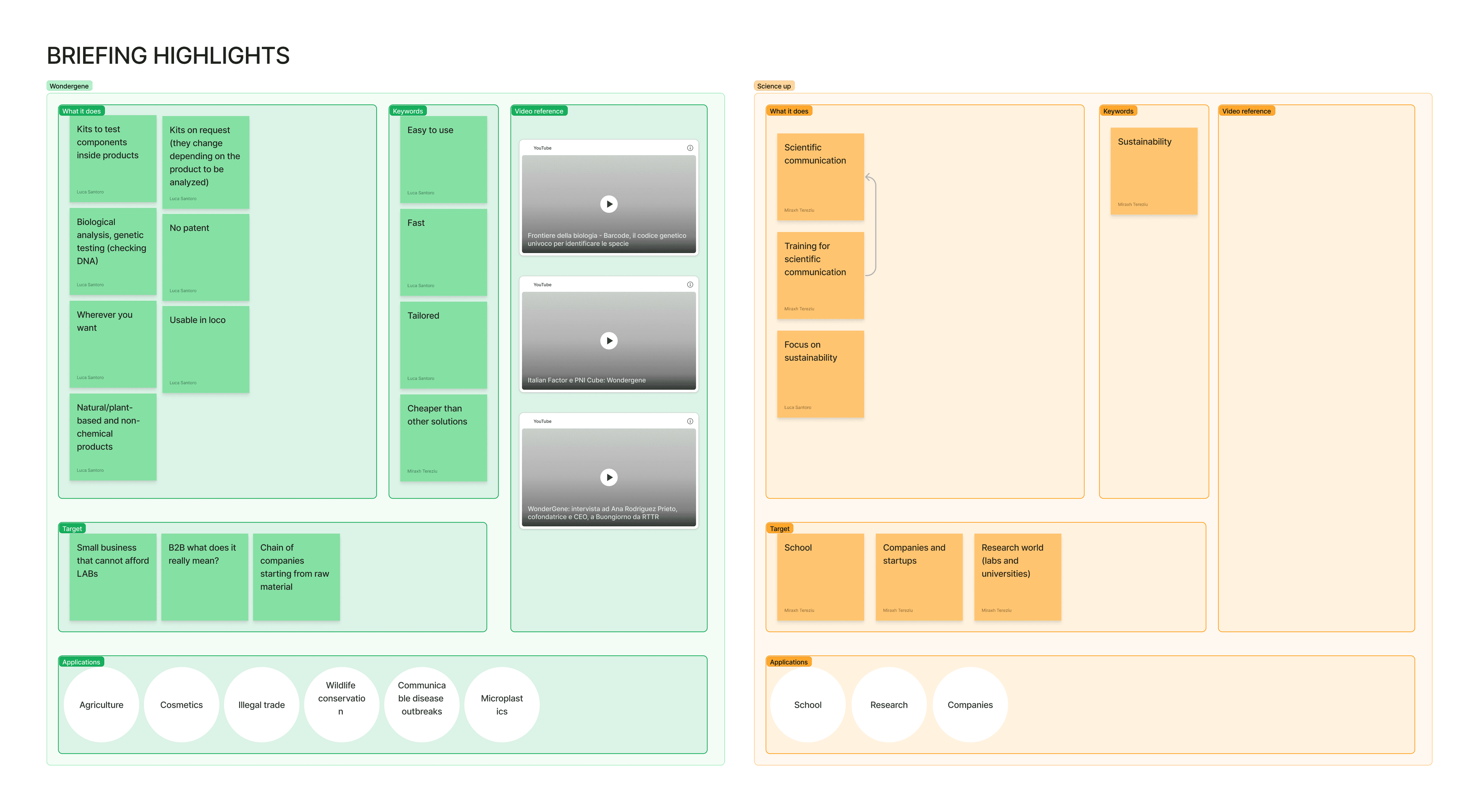
At the end of this initial phase, we outlined two personas*, who represent two possible users of the Wondergene/ScienceUP services.
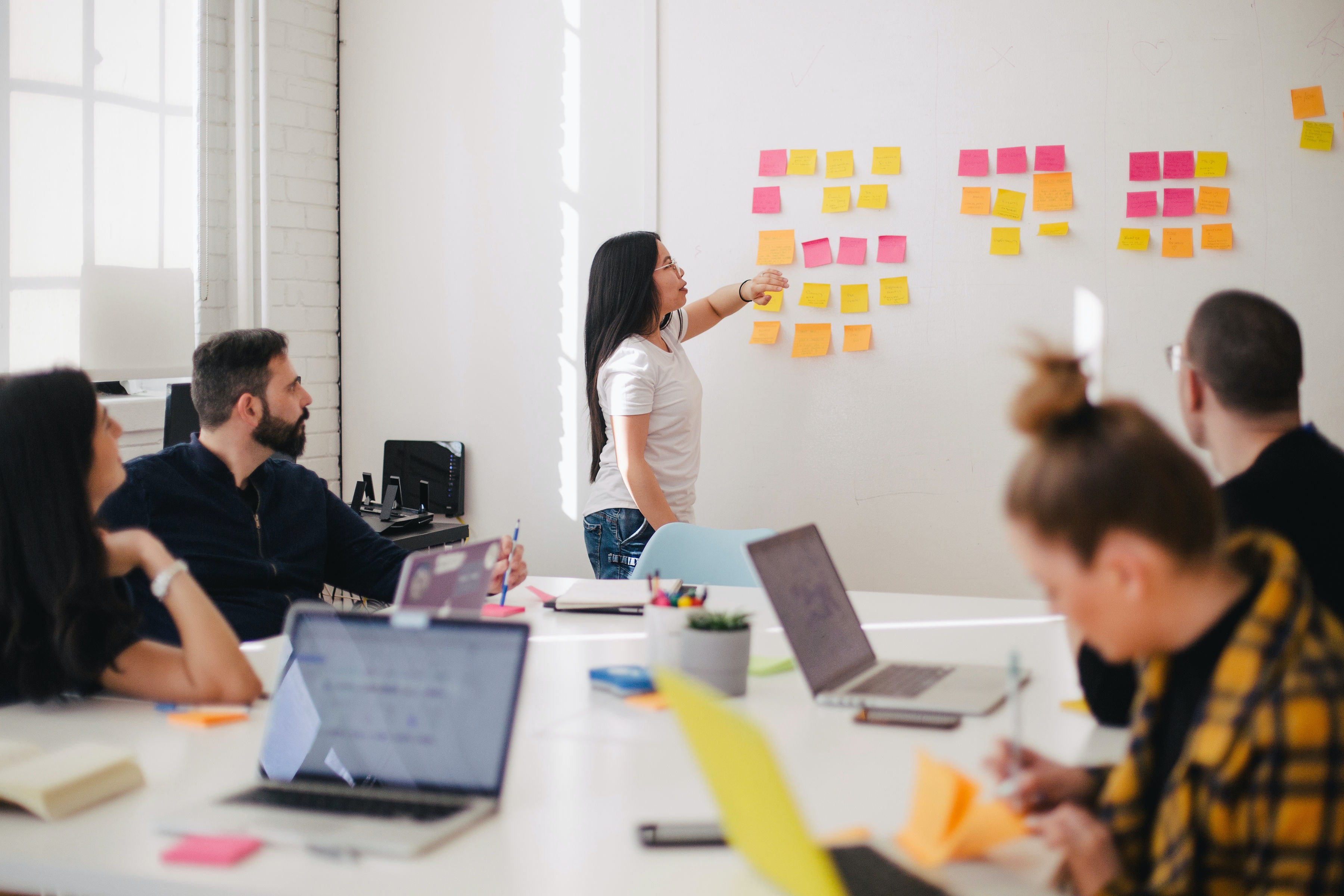
Snapshots of the brainstorming phase (FigJam)
lots of brainstorming, virtual (and real) post-its!
Defining goals.
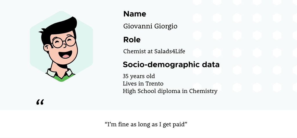
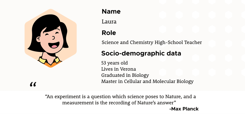
A glimpse at the personas.
* Unfortunately, due to Covid and University restrictions, we couldn't involve actual users. The personas are the result of our assumptions and of the information about the company we've been given.
DEFINE
We defined the broad concept of the website through a Moodboard.
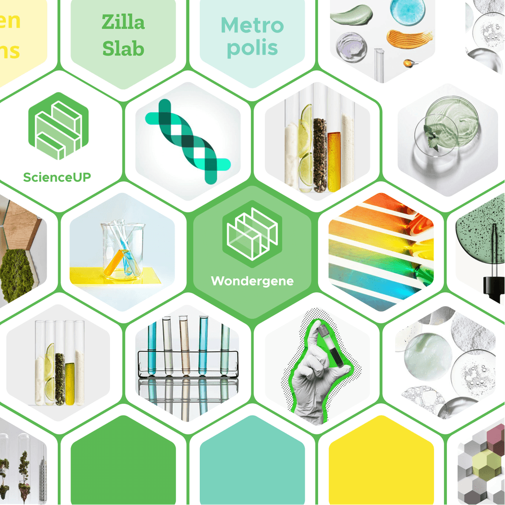
colours
hex shapes
fonts
look&feel
IDEATE
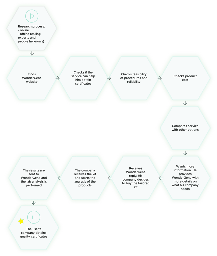
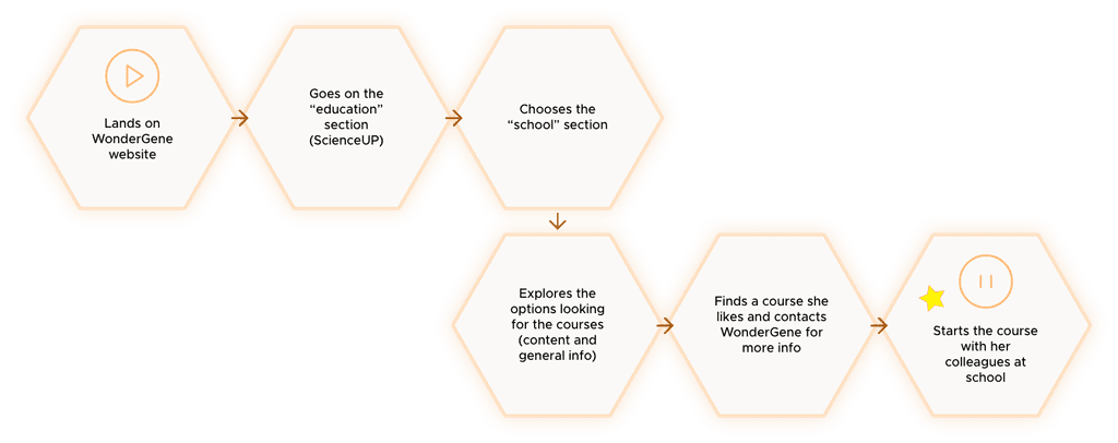
We identified 2 different user flows for our 2 personas. They then guided our design choices and helped us focus on what really mattered: what was really needed by these categories of customers.
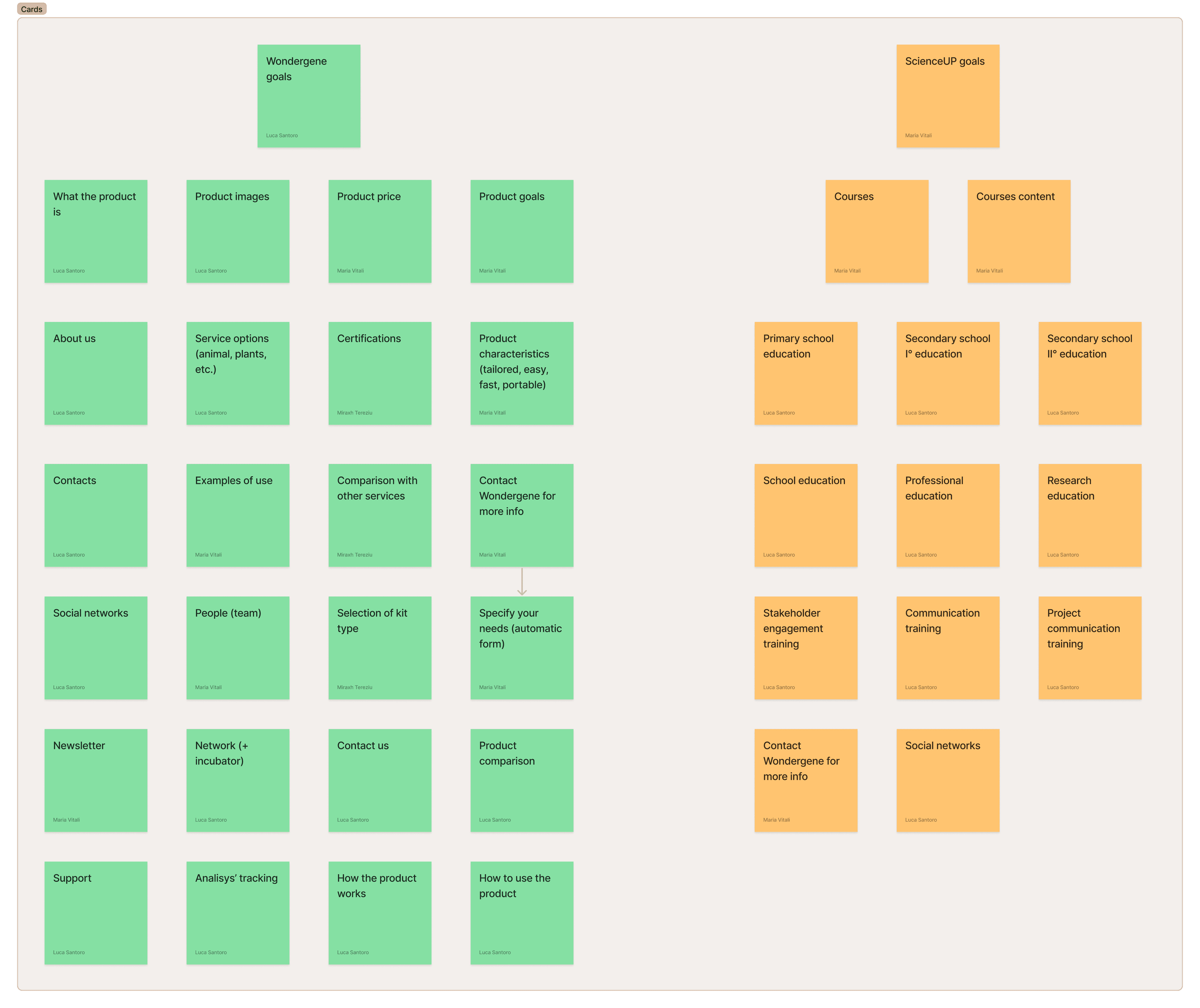
With all the information on customers, the company objectives, and the content to be displayed, we moved on to work on the information architecture of the website.
Through a simple yet effective Card Sorting, we started by identifying and organising within the website, every information we wanted it to convey.
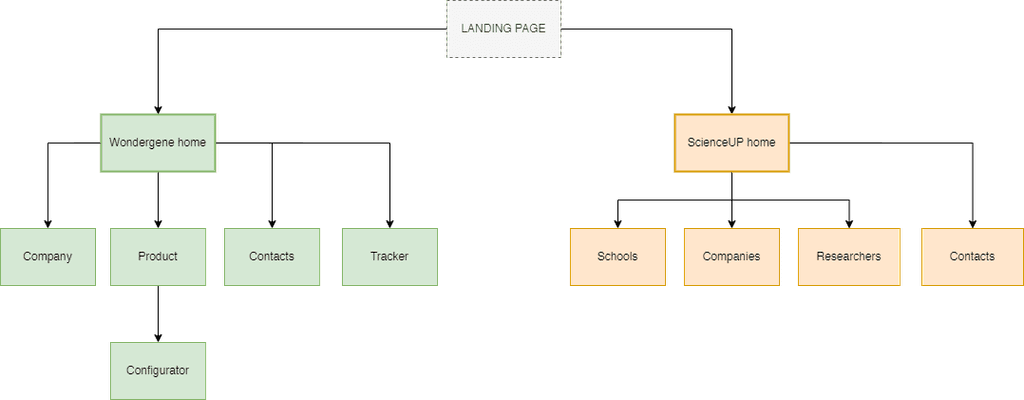
At this point, outlining the site map was pretty straightforward and, after a few iterations, we found the structure we were looking for.
Having all the elements, contents and requirements of the website at our disposal, we brought in the game our creativity and started outlining the paper-and-pencil wireframe of the website.
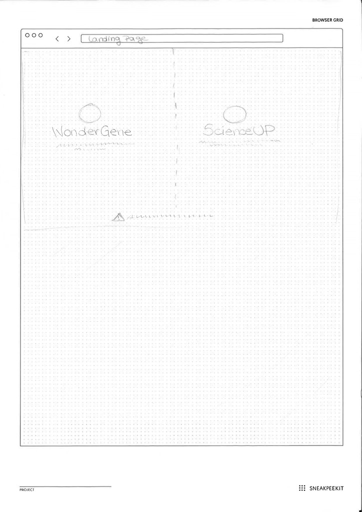
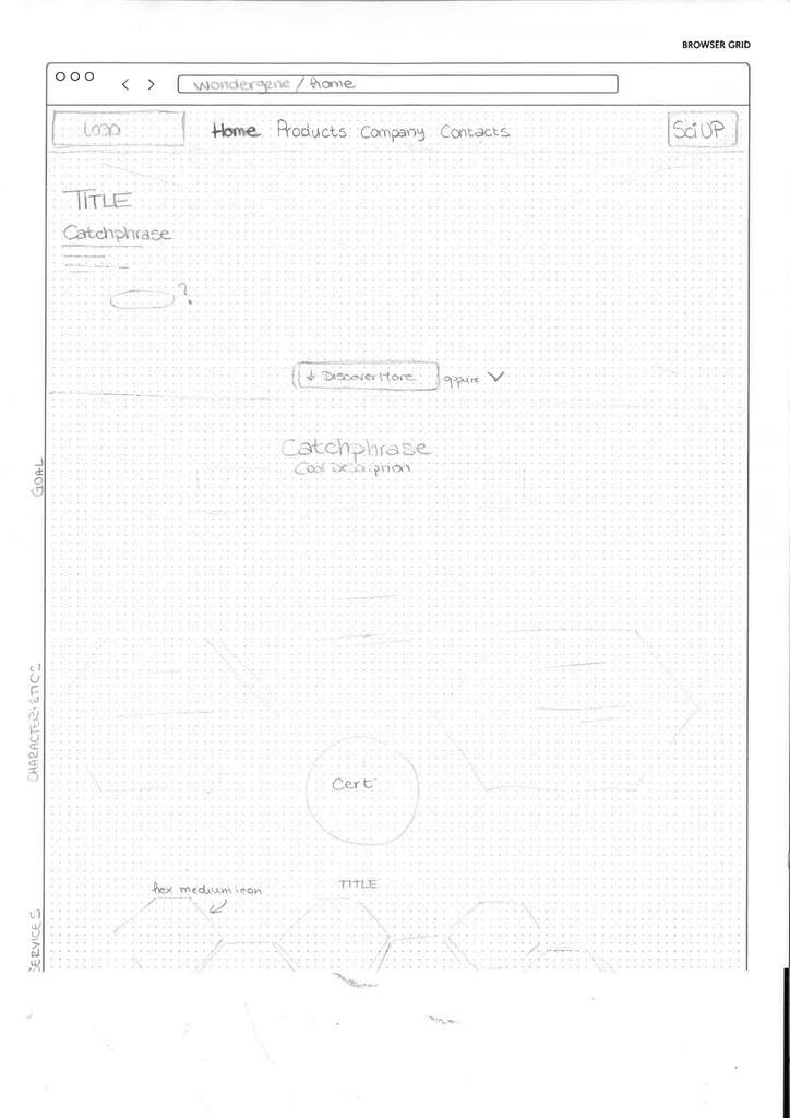
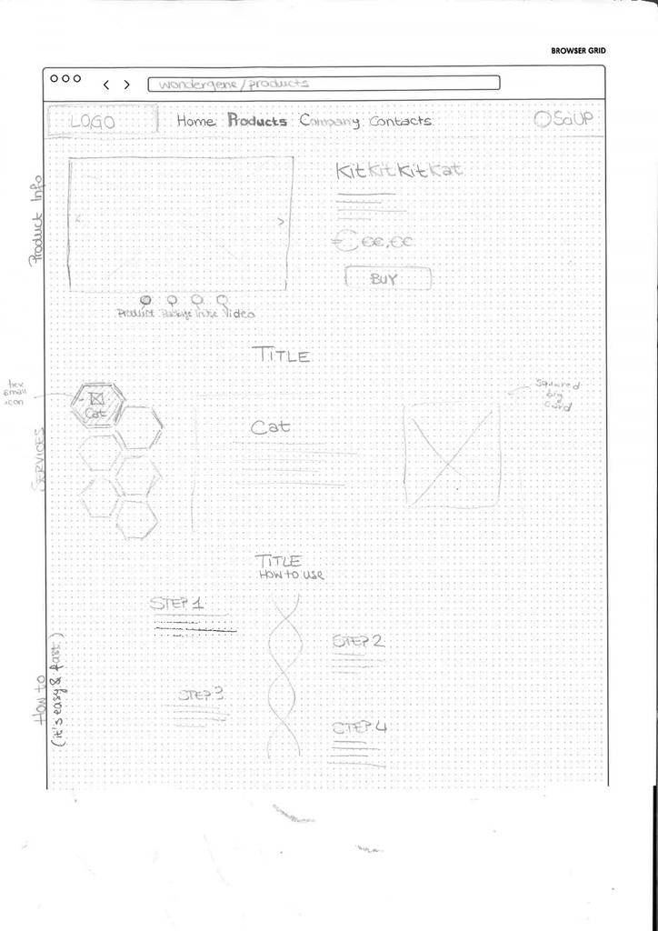


"Paper-and-pencil" wireframe.
PROTOTYPE
Starting from our personas, the moodboard, the ideas collected during the design process so far, we outlined a design system, consistent with the brand and the company requirements.
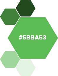
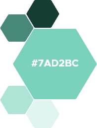
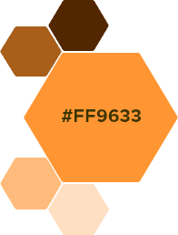
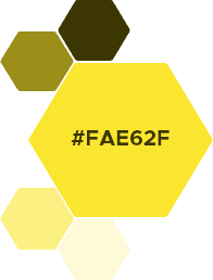
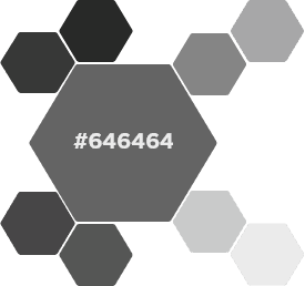
The color palette.
We decided to address the integration problem between Wondergene and ScienceUP (the 2 different sides of the company) by choosing different colours to distinguish the two: green and turquoise on one side, orange and yellow on the other.
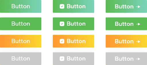
Buttons and cards.
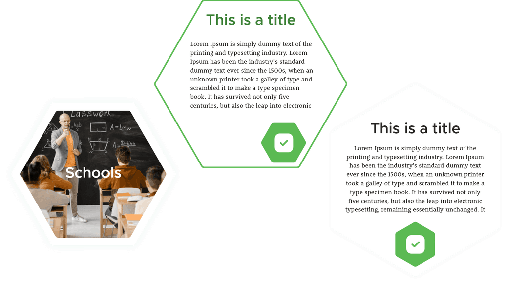
Every other element or component was consistent with the hexagon-themed mood and with the colours.
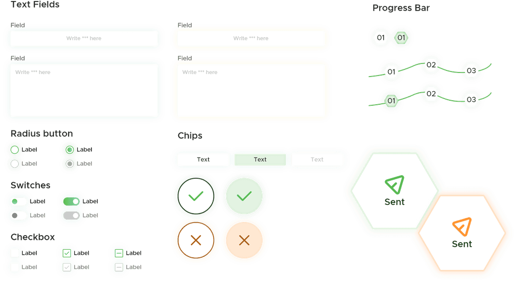
Some components of the design system.
After many iterations and different versions of the final prototype, we presented our final redesign, ready to be tested with users.

explore mockups
TEST
Due to the University project restrictions and the COVID-19 pandemic, we did not have the chance to test the website with actual users, In the meantime, in order to collect valuable feedback on our re-design, we had some professional designers test it out.
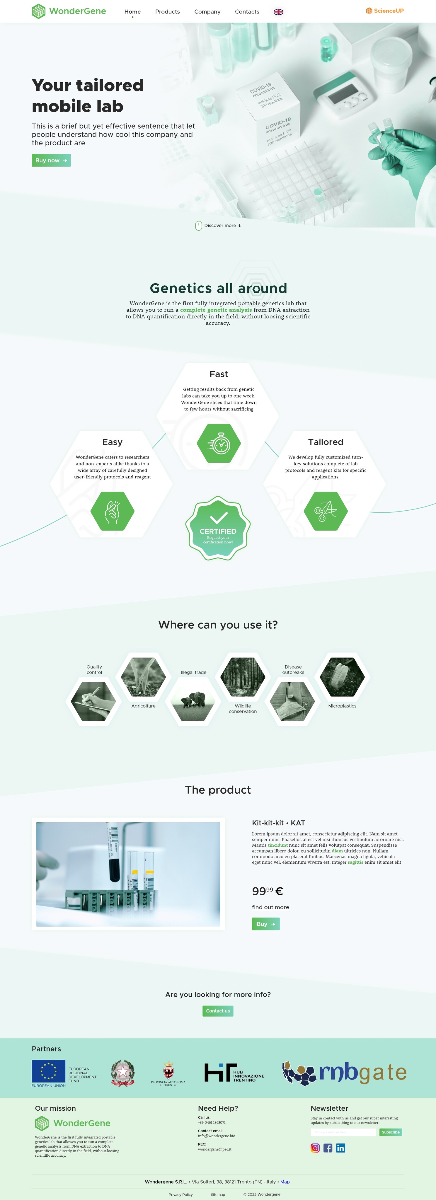
Check out the final revised prototype of part of the company website.
LOOKING BACK
Lessons learned
Re-design according to someone's design guidelines.
Understanding requirements from different stakeholders.
Fast iterations in design are fundamental.
Structuring a well-organised design system is extremely helpful in the long run.